

E-commerce is the king of the digital age, And If you’re running a Shopify store, it’s crucial to prioritize your mobile customers.
Wondering why?
According to Statista, mobile commerce (m-commerce) sales are projected to exceed $543 billion in 2024, accounting for 40.4% of all e-commerce sales.
Consequently, Shopify mobile optimization is an absolute must for online businesses.
Today, We will talk about Shopify mobile optimization & explore why it’s so important.
Furthermore, we’ll provide 11 expert tips to ensure your online store offers an exceptional shopping experience for your mobile users.
Why is Shopify Mobile Optimization important?
People use their smartphones and tablets to shop for products, browse websites, and make purchases. You need to make your Shopify store responsive to mobile devices in order for it to work well.
It is super important, not just a tiny thing. It is a must-do strategy to boost your online store’s success.
Let’s see why making your Shopify mobile friendly is a big deal.
Mobile Rules the Web: Over 50% of internet traffic comes from mobile devices. Take advantage of this vast audience.
Google’s Love for Mobile: Google prefers mobile friendly sites, boosting your visibility in search results.
Happy Users, More Sales: A smooth mobile experience engages customers, leading to higher sales and fewer abandoned carts.
Build Trust: A well-optimized mobile site shows professionalism and builds trust. A poor one can drive customers away.
Top 11 Tips to optimize shopify store for mobile
Mobile compatibility is the key to a successful Shopify store. To help you create a perfectly mobile optimized shopping experience, VKommerce compiled a comprehensive list of 11 tips that will not only boost your store’s appeal.
Tip 1: Improve the Navigation Bar for Easy Use
Due to their limited screen space, mobile devices require a sleek and user-friendly navigation bar. It’s crucial to ensure that your navigation menu is not only straightforward but also concise and easily accessible.
To achieve this, consider employing the ubiquitous hamburger menu icon. Prioritize essential categories and craft an intuitive layout that seamlessly guides your customers through your site.
A responsive and intuitive navigation bar can improve the mobile user experience. It ultimately influences conversion rates.
By simplifying the navigation process, you empower customers to effortlessly find the products they desire, fostering engagement and satisfaction.
Tip 2: Make Visuals Work Well on Mobile Screens
Visual content has a tremendous impact on user engagement and the overall aesthetics of your store. It is essential to optimize all your visuals for mobile screens.
Ensure images, banners, and graphics are visually appealing, load quickly, and scale perfectly on diverse mobile devices. Doing so creates a visually pleasing and seamless mobile shopping experience.
Shopify Mobile optimization goes hand in hand with responsive design. Visuals that work well on mobile screens are more likely to encourage exploration and purchase.
By offering a visually satisfying experience, you can capture your visitors’ attention and keep them engaged, ultimately increasing the likelihood of conversions.
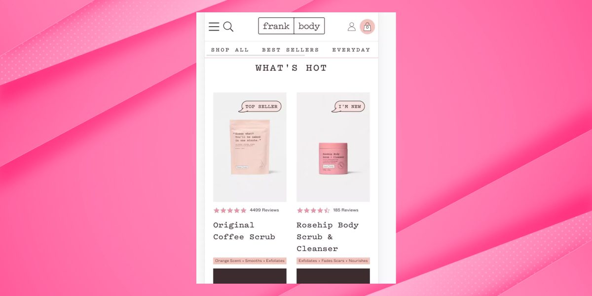
Tip 3: Make Product Images Stand Out

When it comes to Shopify mobile optimization, it’s not just about making visuals work; it’s about making them shine. Your product images need to be showcased at their best.
Utilize high-resolution images and allow for zoom functionality to provide customers with detailed views. Consider incorporating multiple angles or product videos.
High-quality product images can make a difference when attracting and converting mobile shoppers.
The emphasis should be on ensuring that your customers can see and understand your products, even on smaller screens.
This level of detail can instill confidence in the customer and remove any uncertainty, thereby boosting the likelihood of purchase.
Tip 4: Speed Up Mobile Page Loading
One of the paramount aspects of Shopify mobile optimization is speed. Mobile users are notoriously impatient when it comes to page loading times. A sluggish website can quickly lead to customers bouncing off.
To address this issue, optimize your store for mobile by employing strategies such as image compression. Enable browser caching and utilize a Content Delivery Network (CDN) to ensure rapid load times on mobile devices.
Mobile users expect lightning-fast loading times. Meeting these expectations makes you more likely to retain and convert potential customers.
Speed is also a critical factor for search engine rankings, Learn more about Shopify speed score and how it affects search engine rankings
Tip 5: Enhance Buttons for Easy Actions
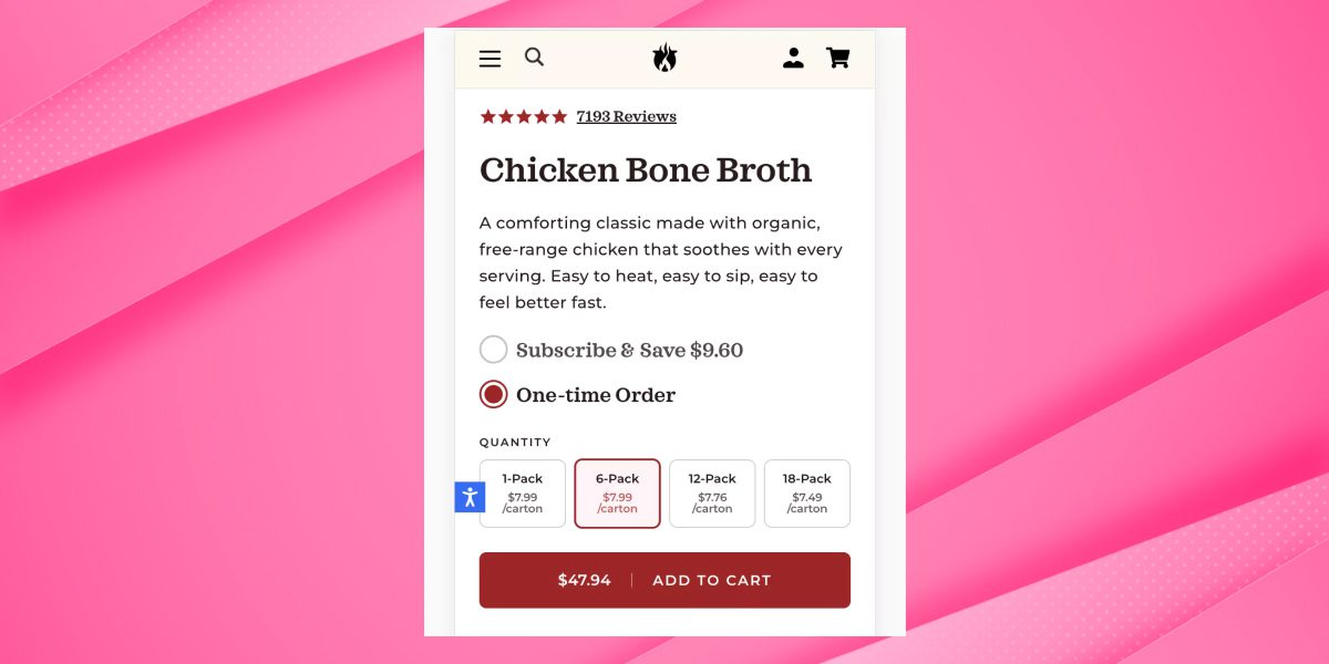
In the mobile environment, buttons are not just functional elements but the driving force behind user actions.
To optimize your Shopify store for mobile, it’s imperative to ensure that your call-to-action buttons, such as “Add to Cart” and “Checkout,” are not only easily accessible but highly visible on mobile screens.
Using contrasting colors and clear, concise text can further enhance the effectiveness of these buttons.
By enhancing buttons for easy actions, you’re streamlining the purchasing process and encouraging visitors to take the desired steps.
Tip 6: Adjust Font Size for Mobile Readability
The readability of your content is paramount when optimizing your store for mobile.
It’s crucial to employ legible fonts and adjust font sizes to ensure your product descriptions, blog posts, and other textual content are easily read on smaller screens.
Minimize the need for users to pinch and zoom to read, making your content more accessible. It ensures a more pleasant browsing experience and helps with search engine optimization (SEO).
Search engines favor mobile-optimized websites with legible text, potentially improving your store’s visibility in search results.
Tip 7: Keep Text Amount in Check
While content is undoubtedly significant for informing and engaging your customers, striking a balance is essential. Excessive text can overwhelm mobile users.
Ensure that your product descriptions and other content are concise, to the point, and broken into shorter, digestible chunks.
Keeping text amount in check makes your content more appealing and manageable for mobile users. This approach can facilitate quicker decision-making and enhance the overall shopping experience.
Tip 8: Avoid Annoying Pop-Ups
Pop-ups can be a double-edged sword in the world of Shopify mobile optimization.
While they can effectively collect email addresses or promote special offers, intrusive or poorly timed pop-ups can frustrate mobile users.
If you choose pop-ups, ensure they are discreet, easy to dismiss, and appear at the right moments in the user journey.
Balancing the use of pop-ups is crucial. When implemented thoughtfully, they can be a valuable tool for engaging customers without compromising their experience.
Tip 9: Fix Any Layout Problems
Your store’s layout should adapt seamlessly to different screen sizes and orientations. To ensure perfect Shopify mobile optimization, you must rigorously test your store on various devices.
Identify and rectify layout issues, such as overlapping elements or text cutoffs. A mobile-optimized layout is the cornerstone of a user-friendly shopping experience.
By addressing and resolving layout problems, you’re increasing user satisfaction and preventing potential customers from being deterred by frustrating navigation and presentation issues.
Tip 10: Smooth Out the Mobile Checkout Process
The checkout process is often a make-or-break moment for e-commerce stores, particularly on mobile devices.
A complicated and lengthy checkout process can lead to cart abandonment. To streamline your mobile checkout process, minimize the number of steps, and consider offering guest checkouts.
Simplifying the mobile checkout process can significantly reduce cart abandonment rates and enhance the likelihood of successful conversions.
Tip 11: Simplify Mobile Form Usage
Forms are a common feature in e-commerce, from contact forms to collecting shipping and billing information. It’s vital to simplify form usage by implementing mobile-friendly input fields.
Enable auto-fill options and provide clear error messages when necessary. The goal is to make it as easy for customers to complete forms on mobile devices as possible.
Optimizing forms for mobile usage is essential for ensuring a smooth and hassle-free shopping experience. By simplifying this aspect, you can further encourage users to complete their transactions.
How to Optimize Shopify store for mobile?
After implementing these 11 optimization tips, monitoring your Shopify mobile optimization of your store’s is crucial. Our Shopify Speed Optimization Services will help you streamline this process and ensure a seamless user experience across all devices and browsers.
Frequent testing and analysis are necessary to ensure its seamless functionality across various devices and browsers.
Use real devices and online tools that simulate different mobile devices and browsers to assess the user experience.
Employ performance analysis tools such as Google’s PageSpeed Insights to gain valuable insights into your website’s mobile performance.
By continuously monitoring and adjusting your Shopify mobile optimization, you’re better equipped to provide the best possible experience for your customers.
FAQ’s
How do I optimize my Shopify mobile?
To optimize your Shopify store for mobile, start by selecting a mobile-responsive theme from Shopify’s theme store.
Ensure your content and images of Shopify mobile friendly, and keep your product descriptions concise. Optimize page load times by compressing images and reducing unnecessary elements.
Test your store on different mobile devices to ensure it’s user-friendly and easy to navigate.
How do I optimize an image for mobile Shopify?
To optimize images for mobile on Shopify, use the correct image dimensions and formats. Stick to JPEG or PNG formats and ensure images are compressed for faster loading.
Use descriptive file names and add alt text to images for accessibility. Keep image file sizes small while maintaining good quality to improve the mobile user experience.
How to make your Shopify store mobile friendly ?
To Shopify mobile friendly, here are some simple and easy tips which can help you:
- Choose a responsive theme.
- Optimize images and content for mobile.
- Ensure fast loading times.
- Simplify navigation and menus.
- Use mobile-friendly fonts and buttons.
- Test on various devices for compatibility.
- Prioritize user experience and design.
- Implement a mobile-responsive checkout process.
- Use mobile SEO best practices.
- Regularly test and refine for mobile users.
Is Shopify mobile friendly?
Yes, most Shopify themes are mobile friendly and adapt to various screen sizes and devices.
However, it’s crucial to double-check that your chosen theme is responsive and that your content and images are appropriately formatted for mobile.
Regularly testing and optimizing your store for mobile is essential to ensure a positive user experience.
How do I optimize my mobile eCommerce?
Start with a responsive and user-friendly website design to optimize your mobile eCommerce. Ensure that the checkout process is straightforward and secure.
Implement mobile payment options and create a dedicated mobile app for your store. Use mobile marketing strategies like SMS and push notifications, and regularly analyze mobile user data to make improvements.